
The eyes are the "Alpha and Omega"
of (real) Byzantine Art
by Hilary White
(previously published: Substack, February 2024)
Why does this face bother us so much?
Do you feel vaguely threatened by it? Disquieted? Does it seem just “wrong” somehow? We’re going to take a careful, analytical look at it to figure out what’s wrong based on the standard Byzantine canonical forms for iconography.
All will become clear.

When we look at a human face with enormously dilated pupils, we subconsciously register a potential threat. This is built into our autonomic system; we can’t help it.
Whenever the subject of Marko Rupnik’s work comes up on social media, people always talk about the “black soulless eyes” or the “black voids” for eyes that are the stand-out feature of his style. People feel this instinctively; we look at this kind of work and even if we know nothing about Byzantine sacred art, we can feel there is something off about this depiction; it’s wrong at a visceral level.
They’re “demonic,” is the thing you hear most often in comments on Twitter and Facebook. I get a little exasperated by this and always feel like saying, “OK, cool your jets, people; Hollywood has invented the ‘black eyes = demons’ trope for you. Real life isn’t the X-files and not everything we don’t like is demons.” But at the same time, there’s a good reason the movie/TV industry has adopted the trope. Certain physiological changes show in the pupillary response, and generate a threat-response in the viewer. We’ll talk about that.
Rupnik’s art isn’t “medieval” or Byzantine. It’s not really even based on those forms. In fact, it’s a parody of them. It is a visual expression of the modern sophisticate’s bigotry against the rational, orderly and theologically oriented medieval mind; a sneer and a nasty snicker up the sleeve. His is the kind of mind that assumes that order and freedom and rationality were invented in the 18th century, Enlightenment developments of the Renaissance return to Classical Greek and Roman thought, unknown to primitive and superstitious medievals.
I’ve given a pretty in-depth examination of his work generally from the point of view of the canons of Byzantine art. We know now why Marko Rupnik’s work isn’t just bad art, but a deliberate subversive parody and mockery of Byzantine art and of its spiritual purpose and nature. (What are the “canons”? Click here.)
I did diagrams and everything.

It’s not that he’s failed to make his lines parallel or his angles make sense or the compositions to be Christocentric; it’s that he meant for it to not do those things. This isn’t incompetence; it’s malice. It’s subversion. He understands that iconography is visual theology, and this iconography is visual heresy, or heresy in pictures. His - or I should say theirs, since he is a representative of a larger movement - is an ideology of chaos, randomness and ultimately nihilistic meaninglessness.
A little more on the Canons
In our piece on the canons of sacred art, we talked about proportionality of the human form. We saw that every measurement you can take of a particular part of the figure is related in some way to all the others. And it is this principle of integrated proportionality upon which Byzantine iconography, in all its various national iterations, is based. This is the basis of classical depictions of the human form, and was taught as the normal part of the training to everyone who wanted to be a figure painter in any genre[1] until the 20th century.

We saw that the human figure is “mappable” - you can start with one part - the head, or even the nose - and work out very exactly the size of everything else from the first form. Taking these measurements you can construct the entire form, in every detail. No need for drawing from a live model.
When you use these rules or ”canons” the figure will have a believable, natural look to it. We humans are hard wired to recognise these details in the human form, and we always know, even if we can’t articulate exactly why, when something is wrong or off. It’s instinctive.

Look carefully at the eyes. Michelangelo followed the normal method of distinguishing the pupils from the iris in his stone carving technique. It’s not accidental. An eye without this distinction generates an automatic, subconscious reaction of fear or disquiet in the viewer. It shows something is wrong; blindness at least.
And we definitely know when it’s right, even if we don’t know why we know. These orderly human proportions are instantly recognisable when they’re correct. And that exactitude in Byzantine art is intended for theological reasons - that is, it is intended to depict the perfections of the heavenly reality, the human form in its ideal, redeemed state.
“Eyes are the alpha and the omega of iconography.”
Human art has always been aware of the power of the eyes in the depiction of character through expression. All figure and portrait painters in every genre understand that a portrait’s expression is based on the eyes more than any other feature.

Classically trained Byzantine iconographers are taught how to apply this fundamental principle in minute detail and the rules for getting the eyes right are very stringent. Get the eyes wrong and the icon is ruined for its spiritual purpose; depicting the sanctification of the human form through Christ’s Incarnation.
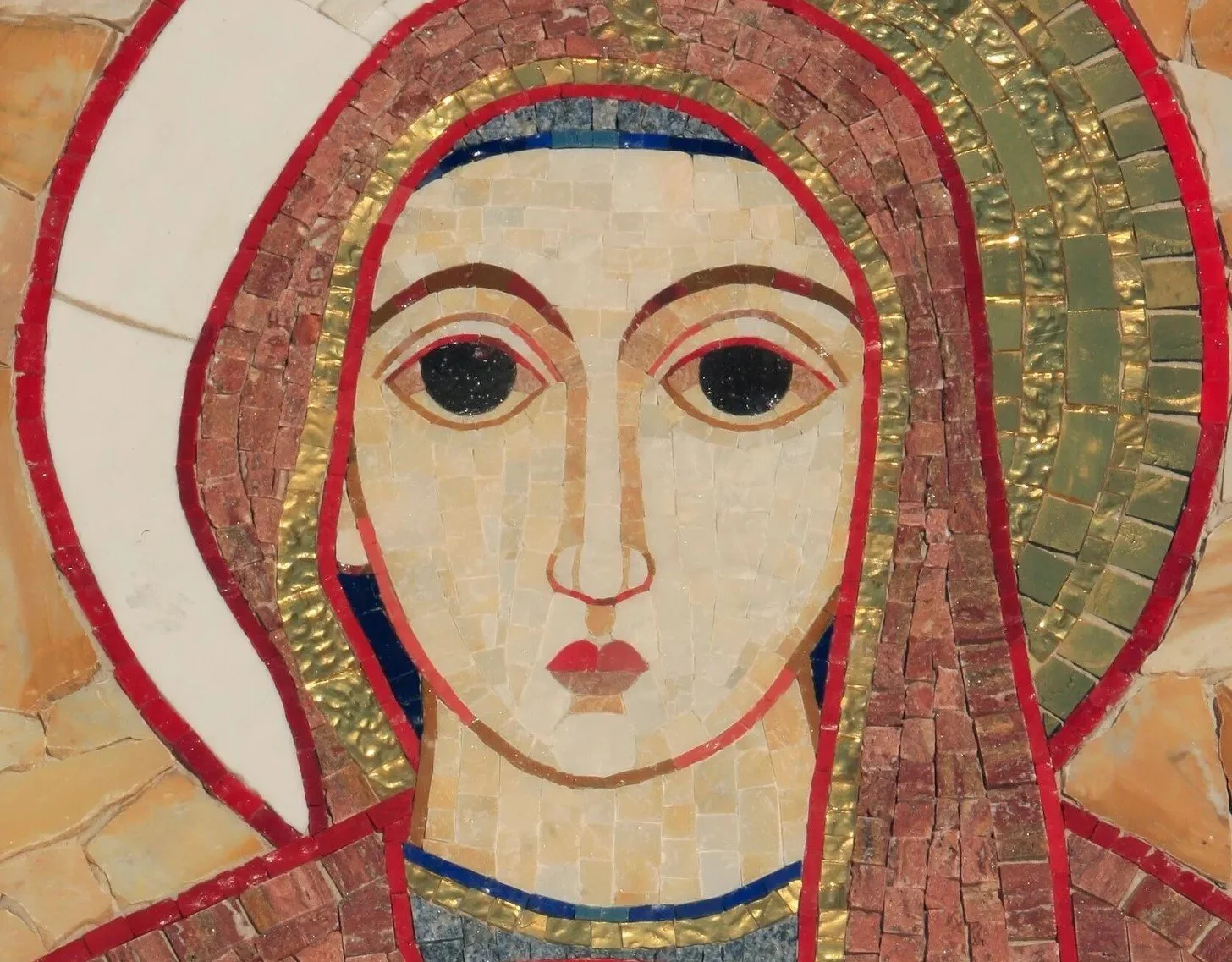
So let’s take a closer look at the sample of Rupnik’s work above and see if we can analyse it according to the Byzantine standards. It quickly becomes clear that there’s a lot more wrong with the face than just the eyes.
In real Byzantine iconography, the face is constructed based on the length of the nose, from the bottom of the tip of the nose to the imaginary line that joins the eyebrows.

The face is normally divided into three “noses” - one length from the bottom of the chin to the tip of the nose and the third from the top line of the nose to the hairline.

Like this
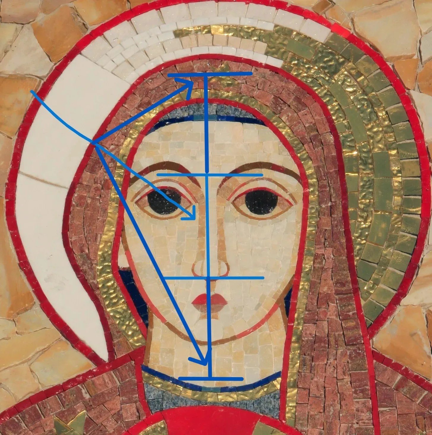
On this face of Rupnik’s Madonna and Child, this is what we get if we apply those standard canons. You can see that taking the “three noses long” rule of Byzantine iconography, the line of the bottom of the chin is nearly at the base of her neck, and the top of her forehead/hairline is half way over the top of her skull. We can say the head is longitudinally truncated or the nose ridiculously elongated, but either way these are not Byzantine proportions.
The eyes are normally constructed based on the nose length as well, with the distance between the pupils being the length of one nose, and the far corners of each eye being about two nose lengths apart[2].
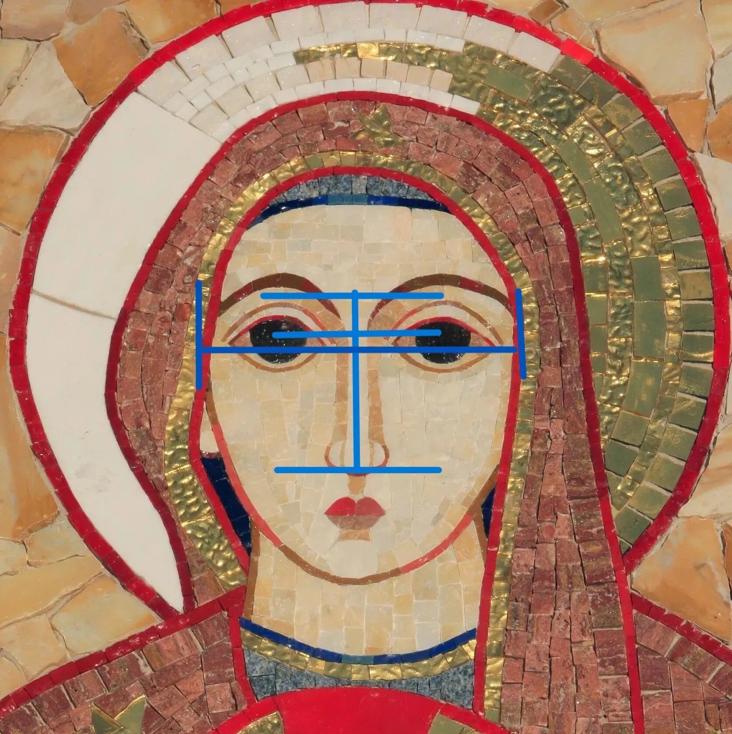
You can easily see that his vertical proportions having been way off, the eyes are completely wrong as well. Oddly, because the nose is so enormously lengthened in proportion to the length of the face, the eyes, although they look ludicrously over-sized for the face, are actually much too small. The centres of the black disks (there are no pupils) are the right length apart - one nose. But the distance between the two outer corners of the eyes is much too short to fit the long nose length.
So in fact, although the oddly truncated vertical proportions of the face make them seem huge, the problem with the eyes is really that they’re too small - as is the rest of the face - in relation to the central and crucial feature, the nose.
It’s important to note that the Byzantine canons for facial and figure proportions are not arbitrary or culturally determined. They’re based on observation of nature; us. If you took the canons and a pair of calipers and tried it on yourself you’d see. This isn’t a “Byzantine thing” - it’s a God-thing.


Byzantine eyes, ancient and modern, can express any human state of mind. But the one thing you'll never find in them is emptiness.


Now we can talk about the “black disks”.
Antonis the iconographer in the video above says the “eyes are of course the alpha and the omega of iconography.” The one rule: get the eyes right, can be extended to all figure and portrait painting. Human beings from infancy learn to judge the disposition of the other person by the eyes. We look at a face and we see the eyes most of all.
Here’s the serious artistic reason why the eyes in Rupnik’s work are wrong, and most decidedly not in keeping with either the eastern or western traditions of sacred art: they’re expressionless. The blank Rupnik stare is the expression of a lifeless doll.
Neurologists, psychologists and anthropologists are in rare agreement on the importance of seeing the eyes in facial recognition, all the way back to our infancy. From looking at eyes, we do our social interaction and bonding. Focusing on the eyes helps us understand emotions, intentions, and attention.
We do our threat detection the same way. Our brains have dedicated areas specifically designed for facial recognition and processing of expression and it is particularly sensitive to the eye region. This neural specialization enhances our ability to extract vital survival information from looking at eyes. We do it automatically and instantly.
One of the big cues we see and react to subconsciously is the dilation and constriction of the pupils. Pupillary response can indicate an array of stimuli, from sexual arousal to imminent mortal threat. Pupils dilate in response to changes in light, but also stress and fear. It seems to be true that in the Renaissance period it was a common cosmetic practice to put drops made from the Belladonna, “Atropa belladonna,” plant in a woman’s eyes to simulate sexual interest, the same reason women use lipstick today. Belladonna contains atropine, which acts to block certain nerve impulses which dilates the pupils. Of course, “Belladonna” means “Beautiful woman” in Italian.
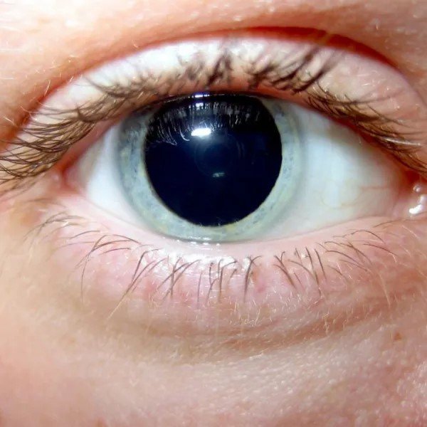
Pupil under bright light fully dilated in response to LSD
It’s worth mentioning that widely dilated pupils is also a response to drugs; stimulants, hallucinogens like LSD, and certain pain relievers.

Apparently you can buy “vampire” contact lenses that erase the colour distinction between the iris and pupil, to create that “Don’t trust me, I’m a LARPing narcissist” effect at the Hallowe’en party.
The use of “black eyes” as a standard trope or visual motif in horror and sci fi films and tv shows reflects our instinctive understanding of these physiological facts. Pretty much all humanoid monsters - vampires and especially people who’ve been possessed - are given the all-black eyes as the visual indicator that “Something is wrong here.” This looks like a person, but it is fooling you and is really a monster in a human-suit who is about to eat you; just look at the black eyes. They’re often changed abruptly from normal eyes to all-black as a cliched but effective jump-scare.
This is because we have that infallible, instinctive understanding that a person coming at us with enormously dilated pupils is a potential threat.
And this brings us back to Rupnik, and his … odd … choice to depict every one of his iconographic faces with this kind of eye. Apart from the general look of “faux primitivism” and his use of deliberately chaotic and disconnected lines and angles, the “black eyes” are his stand-out feature; we’re obviously meant to notice and take home some message. What emotional state most commonly causes this in another person? Sexual arousal or a fear response to a mortal threat, or rage. Or drugs. Not what you might think a famous Christian artist would be going for.

“Grotesques” - caricature studies by Leonardo da Vinci. There’s no reason to suppose these were taken from life rather than simply the work of a master of the canons and anatomy messing about with them deliberately.
Artists know what they’re doing
Someone on Twitter suggested that maybe Rupnik’s work is like this because he’s just not very good, and doesn’t know how to make eyes look natural or doesn’t know the Byzantine canons. But this comment, however it might have been charitably intended, betrays a lack of knowledge of how art works. Rupnik, as I said, is a kind of ideological poster-boy, an expert propagandist using a style of art popularised in the late 60s and 70s to convey a particular message.
What characterises it? In a single word? Childishness. It’s deliberately intended to look “primitive,” like artwork from a kindergarten class: bright colours in big blocks, wobbly, mismatched or unparallel lines and angles, visual incoherence, and only vaguely representational - like a child’s stick figure portraits of his mother and father. This comported well with the social fad at the end of the 1960s to reject previous standards of behaviour and adopt a child-like, groovy, care-free approach to life, including religion. Rules, in art and religion, are for squares, man.
Artists make choices, and the really good artists make their choices based on knowledge. For all that we are appalled by his work, and his acts, he is certainly very successful at his work.
Only a keen and highly trained observational skill can take the characteristics of a face and render them in a deliberately distorted way to make an effective and eloquent caricature. The rules of art are like the vocabulary, grammar and syntax of a verbal language. A great writer can take them and use them however he wants to create particular effects and send particular messages.
If you want to deliberately distort the proportions to create particular effects, you have to start by knowing intimately what they are and how various changes will be perceived. It’s not plausible that Marko Rupnik’s work, and the clear message it sends, was simply an accident of poor training.
I’m not the only one
Though his work was, until recently, beloved of a certain kind of Catholic churchman and bureaucrat, and is indeed representational of the new ideology that we have suffered under as Christians in the Church since the ‘70s, we’re certainly not alone in decrying it. I showed some of it to a real iconographer and asked him to help me critique it. He responded that he would rather not because looking at blasphemy was too upsetting.
Giorgio Esposito, an Italian Catholic painter of the neo-Baroque school, said recently in an interview that Rupnik’s work shows “only a superficial and purely external imitation of Byzantine painting.”
“The forgery becomes evident in some details: in a too large foot firmly planted on the ground, in a hand too carnal, accustomed more to possession than to prayer, to faces that are all identical, stereotyped, almost made with a stencil, to the expression of a face dazed rather than enraptured in mystical ecstasy.
“…instead of the dazzling light of Tabor, to a too rounded, hasty and superficial design which at times seems to border on comics.”
A well known Italian conservative priest [3], Monsignor Nicola Bux, warned that Rupnik’s work is an exemplar of a whole trend in contemporary western sacred art, mainly driven by the changes in liturgy and theology adopted by the Catholic Church since the 1960s.
“The situation of sacred art has contributed to secularization and the loss of faith. And Rupnik stepped into this void. The commissioning bishops should ask themselves whether the faithful, faced with Rupnik's art, are led to prayer or rather to dancing around the golden calf, which is ourselves."
This really is all a “psyop” - a deliberate distraction tactic
We can get distracted by the professional bafflegab these works’ defenders will use to try to shame or silence opposition. We’re told we’re unsophisticated rubes who can’t understand why Rupnik’s work is “deeply spiritual” or… whatever. But I’m going to tell you now that it’s OK to trust that instinctive, visceral knowledge. Most people are pretty good at subconsciously reading cultural signs and symbols, even if we couldn’t give a learned discourse on a given sample.
We know with this stuff that we’re being told something, and it’s something not very nice. It’s certainly not anything like an “updating” of classical Byzantine sacred art. And the message is decidedly not in keeping with the 2000 year tradition of Christian sacred art. What does it tell us that Rupnik’s art is liked by almost no one but is everywhere? His ubiquity is a symbol of a Faith, a Church, occupied by an enemy power. His work is the ideological propaganda poster of a conqueror seeking to demoralise and psychologically oppress a subject people.
I'm a student of sacred art. I haven't ever looked seriously at the whys of work like his, the official justifications for it - which I'm confident are unreadable academic Jesuit drivel at best. All I know is my gut reaction to it, which is it's garbage. Garbage of a particular kind, but definitely garbage.
Stripping away the pseudo-sophisticated academic nonsense, Rupnik’s work is just more of the greying and wrinkling Flower Children pointing and jeering at our vastly superior spiritual ancestors, like a tribe of barbarian primitives camping in the ruins of the marble Roman palace they’ve just finished pulling down. You can, in fact, trust your gut on this one.
Hilary White lives in Umbria and paints icons. She studies western and eastern Christian sacred art and writes at her Substack, World of Hilarity about art, faith and culture.
This button will take you to my studio blog, Hilary White; Sacred Art, where you can see a gallery showing my progress learning how to paint in the traditional Byzantine and Italian Gothic styles. It includes a link to my PayPal where you can make a donation or set up a monthly support to become a patron. Many thanks to those who have already contributed. At the moment, patronages, one-off donations and occasional sales of paintings are my sole source of income. If you’ve enjoyed this site, I hope you’ll consider donating so I can keep doing it.
If you enjoyed this post and found it useful, I hope you’ll subscribe for more. Free subscriptions are free. Paid memberships will soon have lots of extra material, including paywalled posts going into deep dives on our subject, free downloads of ebooks and high res, printable images and lots of other stuff.
NOTES:
The proportionality of the human form is also the basis of “human scale” classical architecture as well, and the same mathematical proportions show up there; but we can save that for later.
You can test this on yourself in the mirror using a piece of paper to measure your nose and then comparing. You’re probably mostly symmetrical; most people are.
These kinds of priests are perishingly few in this country. The Anglosphere continues to think of Italy as a Catholic nation, but it is in every respect a dying culture, and almost no churchmen are willing to say so in public, knowing that the Church has been deeply complicit for decades.